
Designing a Book Cover That Sells on Amazon
A book cover is your most important marketing tool. Discover how to create a professional design that captures attention and meets Amazon's specific requirements.
30 July 2026 · Updated 30 July 2026 · 6 min read
The Importance of Visual Storytelling
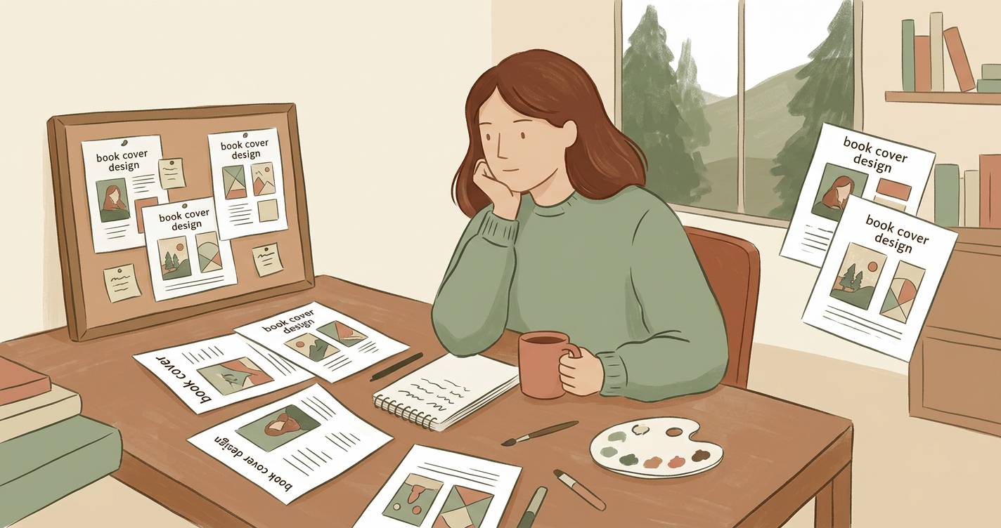
Your cover is the first point of contact between your story and a potential reader. It acts as a visual shorthand, telling the buyer exactly what kind of experience they can expect. A professional cover design does not just look pretty; it functions as a sales tool that communicates genre, tone, and quality instantly.
In the crowded Amazon marketplace, where thousands of titles are uploaded daily, your cover acts as a filter. It helps the right reader find your book while signalling to those who aren't your target audience to keep scrolling. This immediate clarity is what drives click-through rates (CTR). If your cover looks like a psychological thriller but the story is a cozy mystery, you may get clicks, but you won't get sales—and you might even receive negative reviews from disappointed readers who felt misled by the packaging.
Understanding Genre Conventions
Every genre has its own visual language. For example, a thriller often uses high-contrast colours and bold, sans-serif typography, while a historical romance might lean towards softer palettes and elegant serif fonts. Deviating too far from these conventions can confuse readers and lead to lower conversion rates. Before you begin, browse the Amazon bestseller lists in your specific category to identify recurring patterns in layout and colour.
Consider these specific genre markers often found on the Amazon charts:
- Crime & Mystery: Often features a lone figure, a silhouette, or a single evocative object (like a discarded key or a smoking gun) against a dark, moody background.
- Self-Help & Business: Usually relies on "clean" designs with plenty of white space, bold primary colours, and large, authoritative typography that screams "expert."
- Fantasy: Frequently uses ornate, custom lettering and rich, layered textures. Symbols like swords, crowns, or magical elements are common, often set against a backdrop of sprawling landscapes.
- Contemporary Romance: Currently dominated by bright "vector" illustrations, playful hand-lettering, and vibrant, contrasting pastels.
Essential Elements of an Effective Cover
A successful design balances three core components: imagery, typography, and hierarchy. The hierarchy ensures the reader's eye moves in the right order—usually from the central image to the title, and finally to the author's name.
- Thumbnail Legibility: Most readers will see your book as a tiny image on a phone screen. If the title is hard to read at that size, you will lose sales. Test your design by shrinking it down to 100 pixels wide on your screen; if you can't read the title or distinguish the main image, it needs more contrast.
- Focal Point: Avoid a cluttered design. Choose one strong image or symbol that represents the heart of your book. Trying to illustrate every scene from your novel onto one cover results in a messy, amateurish look.
- Colour Palette: Use colours that evoke the emotional response you want from your reader, such as dark blues for mystery or bright yellows for optimistic self-help. Stick to a palette of 2–3 main colours to maintain a sophisticated look.
- Typography: The font should match the "weight" of the story. A heavy, distressed font works for a gritty memoir, while a light, airy script suits a summer beach read.
The Psychology of Layout
The "Rule of Thirds" is just as applicable to book covers as it is to photography. By placing your focal point or your title along the imaginary grid lines that divide your cover into thirds, you create a more balanced and aesthetically pleasing composition. Additionally, consider the "Z-pattern" of eye movement. Readers often scan from the top left to the top right, down to the bottom left, and finishing at the bottom right. Placing your most important hook or author name in these natural resting spots can subtly improve engagement.
Technical Requirements for KDP
When moving from a digital concept to a physical book, you must consider the technical side of typesetting and print preparation. Amazon KDP requires a specific PDF format that includes the front cover, spine, and back cover as a single spread. The spine width is determined by your page count and paper choice, so it is vital to finalise your editing and interior layout before completing the final cover file.
To calculate your spine width accurately, use the following general guidelines for KDP "White Paper" (the most common choice for non-fiction and many novels):
- Black and White interior: Page count multiplied by 0.0572 mm.
- Example: A 300-page book will have a spine width of approximately 17.16 mm.
Remember that if you change your font size or margins during the final stages of formatting, your page count will shift, which in turn alters the spine width. Even a 5-page difference can cause your spine text to sit off-centre if you aren't careful.
The Importance of Bleed and Trim
"Bleed" is a printing term for the area that goes beyond the edge of where the sheet will be trimmed. For a KDP cover, you must extend your background image 3.2 mm (0.125 inches) beyond the final trim size on all outside edges. This ensures that if the paper shifts slightly during the cutting process, you aren't left with an accidental white sliver at the edge of your book.
Common Mistakes to Avoid
Many first-time authors fall into the trap of using low-resolution images, which result in a pixelated print. Images should always be 300 DPI (dots per inch) at the actual size they will be printed. Pulling a 72 DPI image from a website will look blurry and unprofessional on a physical book.
- Too Many Fonts: Using more than two different font families makes a cover look chaotic. Stick to one decorative font for the title and a clean, legible font for the author name and subtitles.
- Poor Contrast: Dark text on a dark background is a common error. Ensure there is a high level of contrast between your lettering and your imagery. If the background is busy, use a subtle drop shadow or a semi-transparent "text box" to make the words pop.
- Ignoring the Spine: The spine is what people see when the book is on a shelf. Ensure the title is oriented correctly (usually top-to-bottom in the UK and US) and is large enough to be read from a few feet away.
- Placing Important Elements in the "Safe Zone": Another common error is placing important text too close to the 'trim line', where it might be cut off during the printing process. Always use a template provided by your publishing platform to ensure your margins and bleed are correct. Keep all text at least 6.4 mm (0.25 inches) away from the edge of the cover.
Step-by-Step Design Checklist
Before you upload your final files to Amazon, run through this practical checklist to ensure your cover is market-ready:
- Research: Have you looked at the top 20 books in your specific Amazon sub-category this week?
- Dimensions: Does your file match the exact requirements for your chosen trim size (e.g., 6x9 inches or 5x8 inches)?
- Resolution: Is every element of your design set to 300 DPI?
- Legibility: Can you read the title clearly when the image is reduced to the size of a postage stamp?
- Spine: Is the spine text centred and does it account for the exact page count of your final formatted manuscript?
- Barcode: Have you left a 50mm x 30mm space on the bottom right of the back cover for the Amazon-generated barcode (unless you are providing your own)?
- Mood: Does the cover accurately reflect the "vibe" of the interior? (e.g., A funny book shouldn't look like a horror novel).
How There's a Book in Everyone helps
We provide the tools to help you bridge the gap between a great idea and a professional finish. Our platform assists with the initial book planning stages, ensuring your concept is strong enough to inspire a winning cover. While you provide the creative spark, our AI-supported tools help you refine your vision so it meets the high standards required for the modern marketplace.
By using our structured approach, you can ensure that your cover isn't just an afterthought, but a core part of your book's identity. We help you think about your audience from day one, so by the time you reach the design phase, you already have a clear understanding of the symbols, colours, and themes that will resonate most with your future readers.
Explore Publishing Support
Preparing to publish? Get guided support for metadata, formatting and publishing preparation. Learn more here.
Read next: Designing a Book Cover for Your Genre
Frequently asked questions
Preparing to publish?
Get guided support for metadata, formatting and publishing preparation.